Descriptive statistics involve methods of organising, summarising, and simplifying data, making it easier to interpret. In the context of sports studies, this is particularly useful for analysing performance data, training outcomes, and other key metrics. This chapter will delve into several key concepts within descriptive statistics, with relevant examples applicable to sports science.
2.5.1 Data visualization
Data visualisation is essential for presenting complex data in a format that is easy to understand. In sports studies, different types of graphs are used depending on the nature and purpose of the data. Below are several types of graphs commonly used in this field, along with the types of variables they are best suited for.
Bar Charts: Useful for comparing different groups. For example, you might use a bar chart to compare the average performance of athletes in various sports.
-
X-axis: Categorical variables (e.g., types of sports).
-
Y-axis: Metric variables (e.g., average performance scores).

Pie Charts: Employed to show the proportion of different categories. For example, a pie chart could illustrate the proportion of different types of injuries in a team over a season.
- Data type: Categorical variables (e.g., injury types).

Line Graphs: Ideal for displaying trends over time. For example, you might use a line graph to track an athlete's performance metrics over a training period.
-
X-axis: Metric variables (e.g., days, time).
-
Y-axis: Metric variables (e.g., recovery %, performance scores).
-
Cluster: Method A, Method B

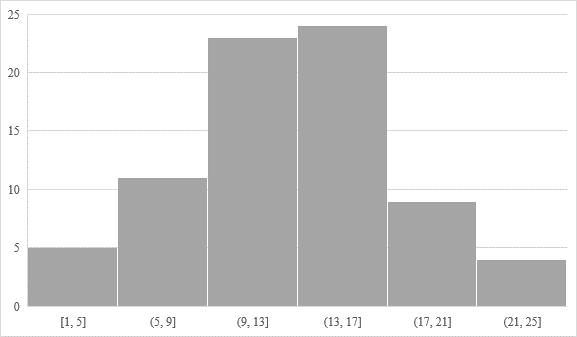
Histograms: Used for showing the distribution of data, such as the frequency of different running times in a race.
-
X-axis: Metric variables (e.g., running times).
-
Y-axis: Frequency (e.g., count of occurrences).
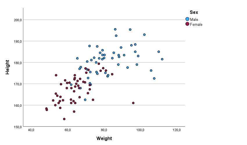
Scatter Plot Graphs: Useful for showing the relationship between two metric variables. In sports studies, a scatter plot could display the relationship between training hours and performance improvement.
-
X-axis: Metric variables (e.g., training hours).
-
Y-axis: Metric variables (e.g., performance improvement).
-
Cluster: Method A, Method B
Box Plot (Box-and-Whisker Plot): This graph is useful for visualising the distribution of a data set and identifying outliers. It displays the median, quartiles, and possible outliers in the data.
-
X-axis: Categorical variables (e.g., different teams or training methods).
-
Y-axis: Metric variables (e.g., test scores or performance metrics).

These examples illustrate how various types of graphs can be used in sports studies to visualise data effectively, allowing for better analysis and interpretation of athlete performance and other key metrics. Understanding which types of variables to use on the x and y axes is crucial for correctly interpreting these visualisations. In sports sciences (based mostly on quantitative data), box plots and scatter plots are among the most commonly used graphs. Therefore, it is essential to understand these graphs in greater detail.
Box Plot (Box-and-Whisker Plot): This type of graph is particularly useful for visualising the distribution of a data set and identifying outliers. It summarises data through five key values: the minimum, first quartile (Q1), median (Q2), third quartile (Q3), and maximum. The box represents the interquartile range (IQR), which is the range between Q1 and Q3, containing the central 50 % of the data. The line within the box indicates the median value, giving a sense of the data’s central tendency. The “whiskers” extend to the smallest and largest values that are within 1.5 times the IQR from Q1 and Q3, respectively. Any data points outside this range are considered outliers and are often marked individually, which can indicate exceptional or poor performance (Figure 3).
Example: A box plot could be used to compare the vertical jump heights of athletes across different teams. The central box will show the spread of the majority of jump heights, while any outliers might indicate athletes with exceptionally high or low jumps compared to their teammates.

Scatter Plot Graph: This graph is highly effective for displaying the relationship between two metric variables, making it invaluable for studies that examine correlations in sports performance data. Each point on a scatter plot represents an individual data point, with its position determined by two variables – one plotted on the x-axis and the other on the y-axis. The scatter plot allows researchers to visually assess whether there is a trend or correlation between the variables, such as a positive, negative, or no correlation at all.
Example: A scatter plot could be used to illustrate the correlation between the number of hours an athlete spends on strength training and their improvement in sprinting speed. Each point on the graph represents an individual athlete, showing how their training hours relate to their performance improvement. If the points form an upward-sloping line, it suggests a positive correlation, meaning that increased training hours are associated with better sprinting performance.
2.5.2 Measures of Distribution
Measures of distribution or frequency indicate how often different outcomes occur within a data set. This can help in understanding patterns in sports data, such as the frequency of certain scores or the distribution of times across a group of athletes.
- Count: The total number of occurrences of a specific outcome (e.g., the number of goals scored by a team in a season).
- Percent: The proportion of the total number of observations that fall into a specific category (e.g., the percentage of matches won by a team).
- Frequency: The number of times a particular value appears in the data set (e.g., the frequency of specific lap times in a swimming competition).
Example: A frequency table might display the number of games played by a basketball team that resulted in different point ranges, providing insights into performance consistency.
| Weight [Kg] | Tally marks | Frequency [n] | Relative Frequency [%] | Cumulative frequency [n] | Cumulative Relative Frequency [%] |
|---|---|---|---|---|---|
[0-20] | // | 2 | 14.29 % | 2 | 14.29 % |
(20-40] | //// | 4 | 28.57 % | 6 | 42.86 % |
(40-60] | //// | 4 | 28.57 % | 10 | 71.43 % |
(60-80] | /// | 3 | 21.43 % | 13 | 92.86 % |
(80-100] | / | 1 | 7.14 % | 14 | 100 % |
2.5.3 Measures of Central Tendency
Measures of central tendency represent the centre or middle of a data set. In sports studies, these measures are crucial for summarising data such as average performance levels.
- Mean: The average of all data points (e.g., the average number of goals scored by a team per game).
- Median: The middle value in a data set when ordered from smallest to largest (e.g., the median reaction time in a set of sprint starts).
- Mode: The most frequently occurring value in a data set (e.g., the most common score achieved in a series of tennis matches).
Example: If analysing the vertical jump heights of a basketball team, the mean jump height might represent the team's average jumping ability, while the mode could highlight the most common jump height among the players.

2.5.4 Measures of Dispersion
Measures of dispersion or variation describe how spread-out data points are, providing insights into the consistency or variability of performance in sports.
-
Range: The difference between the maximum and minimum values (e.g., the range of scores in a series of gymnastics routines).
-
Range ($R$) = $x_{max} - x_{min}$
-
-
Interquartile Range (IQR): The range within which the central 50 % of the data lies (e.g., the IQR of race times in a marathon, showing the middle spread of performance).
-
$IQR = Q_{3}-Q_{1}$
-
-
Standard Deviation $(SD)$: The average amount of variability in a data set (e.g., the $SD$ of a team's scores, indicating how much variation exists in their performance).
-
$SD$ = sample standard deviation
-
$\sigma$ = population standard deviation
-
-
Variance: The square of the standard deviation, providing a measure of how much the data points vary from the mean.
-
$S^2$ = sample variance
-
$\sigma^2$ = population variance
-
Example: In a study measuring the consistency of free throw shooting in basketball, the standard deviation could reveal whether a player’s shooting performance is steady or inconsistent over multiple attempts.
2.5.5 Measures of Position
Measures of position identify the relative position of data points within a distribution. This is important in sports for ranking performances or identifying outliers.
Quantiles: Divide data into equal parts, with specific names depending on the division:
Percentiles: Divide the data into 100 equal parts (e.g., the 90th percentile in a group of swimmers' times, indicating the top 10 % of performers).
Deciles: Divide data into ten equal parts (e.g., the 3rd decile in a fitness test, indicating the bottom 30 % of scores).
Quartiles: Divide data into four equal parts (e.g., $Q_1$, $Q_2$ [or median], and $Q_3$ in an athlete's training data).
Standard Scores (z-scores): Express a data point's position in terms of standard deviations from the mean (e.g., a z-score could show how an athlete’s performance compares to the average in a group).
-
z-score indicates how many standard deviations ($s$) an element is from the mean $(m)$.
$z = \dfrac{x - m}{s}$
-
t-score enables you to take an individual score and transform it into a standardized form, which helps you to compare scores.
$T = 50 + 10z$
-
Example: A z-score might be used to compare an athlete’s performance to a normative group, such as assessing whether a sprinter’s time is above or below the average for their age group.

Review Questions
-
Define and differentiate between the mean, median, and mode.
-
How can standard deviation help in understanding an athlete’s performance consistency?
-
Explain how you might use a percentile rank to assess an athlete’s performance in a fitness test.
-
Describe a situation in sports where a frequency distribution graph would be useful.
Exercises
-
Collect data on a specific sports performance metric (e.g., sprint times) for a group of athletes. Calculate the mean, median, mode, range, and standard deviation of the data.
-
Create a histogram to display the frequency distribution of the data collected in Exercise 1.
-
Calculate the z-scores for each athlete's performance in Exercise 1 and interpret their meaning.